"As an instructor on the Experience Haus UX & UI course, I had the pleasure of teaching Rob. His eagerness, motivation, enthusiasm, and exceptional diligence make it clear that he is destined for success."
Fi Patuck 🇬🇧
Instructor - Experience Haus (London)
Next
Designed an Engaging Landing Page for a Fashion Brand
Overture - Uxcel Course Design Project (Spec) (UI)
The first thing I did was an audit of the website to identify the key issues it was facing. It was apparent that the site had not been looked after and there was a lot of parts that were outdated. Furthermore there were many issues with the layout, colours used and spacing which I would focus on improving. My key goals were to make the overall design more user focused, easy to navigate and accessible to anyone who visits the site. I would later use user research to challenge my thoughts and bring in new ideas.
UX Audit & Insights
Insight Clustering
Minimalist
design
Eye
catching
visual
design
Inviting
colour
calette
Legible
typography
Visual Design
Simple
to
understand
Accessible
language
Sharing
options
Easy
to find
Information
User
friendly
interface
Responsive
Clear CTA’S
Highlight
important
information
Simple and
intuitive
Consistent
and
predictable
Accessible
Easy
to navigate
Interface
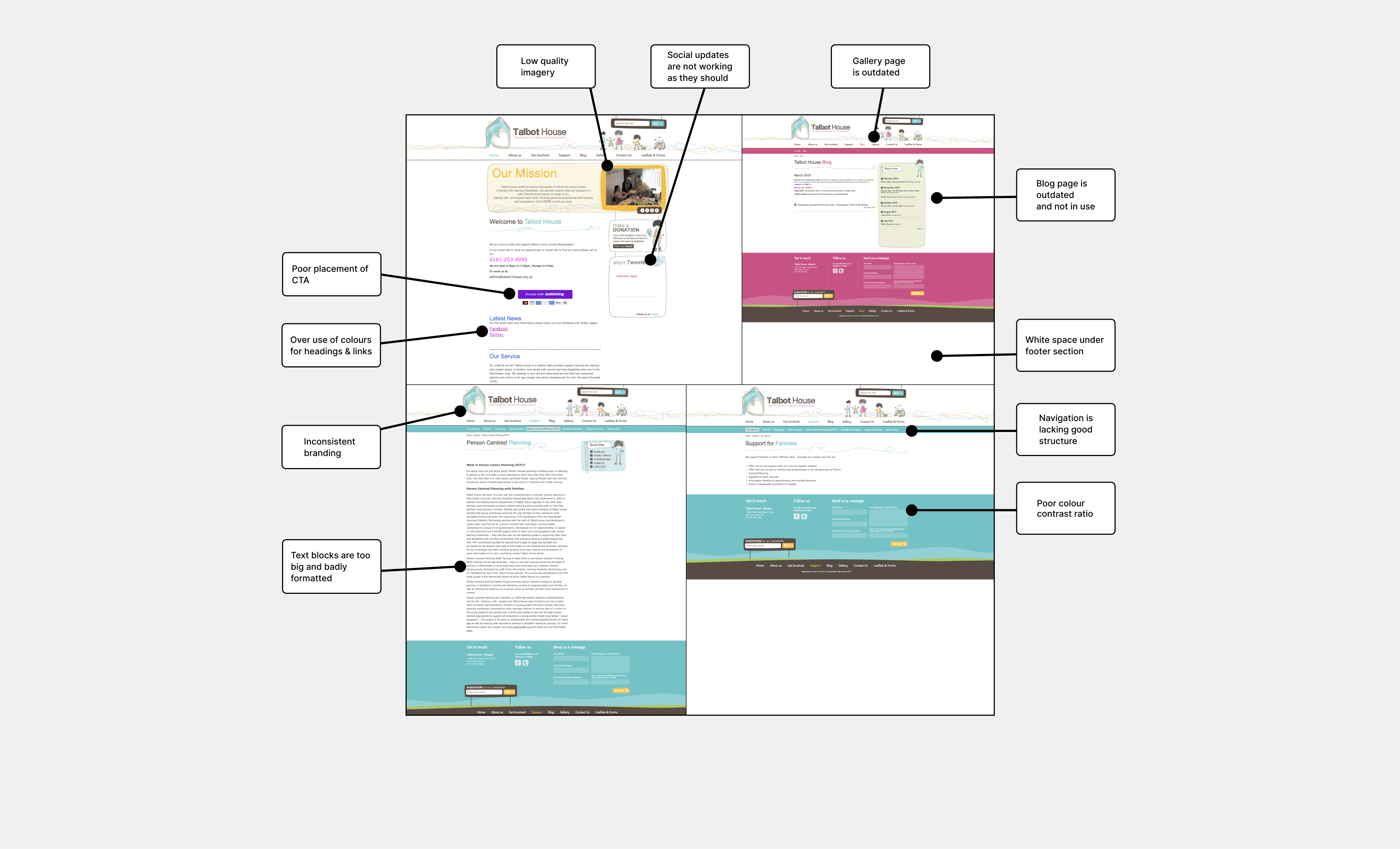
I Challenges
Their site is heavily neglected and much of it has not been updated.
Furthermore there is an overuse of colours for text like headings and links.
Outdated and disorganised features prompted a need for careful scrutiny.
Mobile version is a shrunken desktop site, lacking optimisation for mobile devices and user-friendliness.
Mobile App
Talbot House is a small Manchester based charity that has been supporting families with learning disabilities since 1976. The staff and trustees are parent carers, some with children who have learning difficulties like Down Syndrome or ADHD, or professionals with experience working with people with learning disabilities.
I Talbot House
I What I Did
Redesigned each page to enhance user-friendliness and accessibility, removing unmaintained elements.
Prioritised improving text layouts for clarity and conciseness to facilitate easier navigation.
Restructured navigation to reduce steps for users and minimize the carbon footprint.
Prioritised creating a mobile-friendly version of the website for enhanced user convenience.
Overview
Overview
UX Research/ Wireframing/ Prototyping/ Usability Testing
Spec Project
Talbot House Charity Website
Enhanced a Charity Website's Usability and Aesthetics
Case Study