
Supporting Those With Learning Disabilities
Project Overview
Project: Spring 2024
Analysis & redesign of the site using best UI practices
Restructuring navigation and layout
Making the site more accessible
Reducing the carbon footprint
Mobile first approach

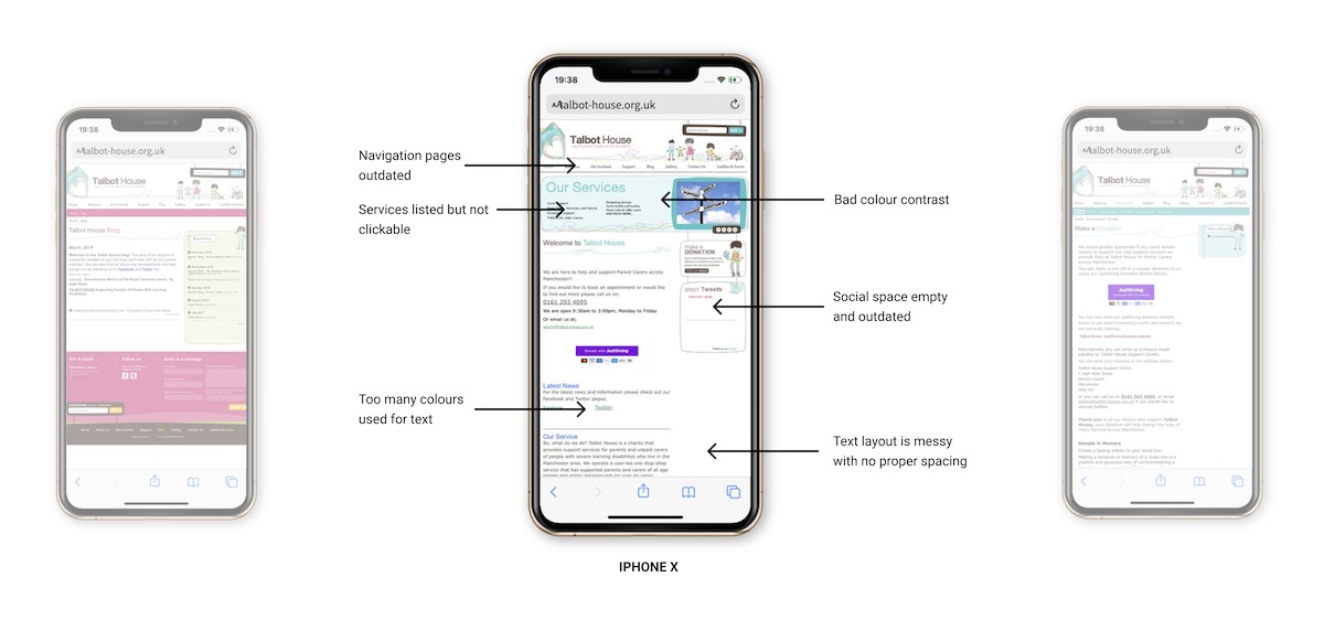
Neglected sections, like the blog, have remained outdated for an extended period.
Overuse of colours for text like headings and links
Outdated and disorganised features prompted a need for careful scrutiny.
The mobile version merely shrunk the desktop site, lacking optimisation for mobile devices and user-friendliness.
Solution
Redesigned each page to enhance user-friendliness and accessibility, removing unmaintained elements.
Prioritised improving text layouts for clarity and conciseness to facilitate easier navigation.
Restructured navigation to reduce steps for users and minimize the carbon footprint.
Prioritised creating a mobile-friendly version of the website for enhanced user convenience.

Research & Planning
Analysing Similar Charities
Researching similar charities allowed me to identify commonalities and differences in how they present information and engage users on their websites. This analysis helped me pinpoint areas for improvement on the Talbot House site.
Hft is a charity providing services for learning disabled people throughout England and Wales.
The Royal Mencap Society is a charity based in the UK that works with people with learning disabilities.
See Ability specialise in supporting those with learning disabilities or autism, who may also have sight loss.
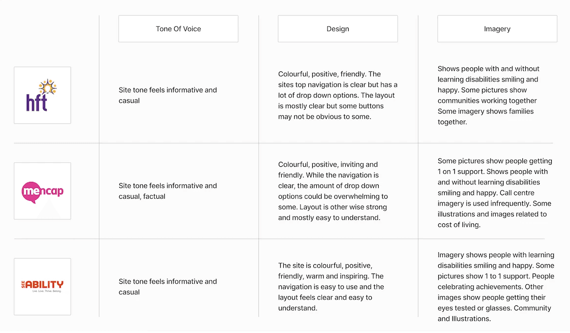
Key Takeaways
- For everyone using the site ensure accessibility, legibility, and clean layouts with clear navigation to promote inclusivity. Facilitate content sharing on the site to enhance awareness among users.
Call to actions should be clear and obvious to the user.
Colours should be clean and strong but clearly identify the difference between site sections
Tonality of the site should be warm, welcoming and empathetic. Give a sense of community and how people can get involved.
Make it clear for the ways in which people can get involved and donate to the charity.
Analysis Of Original Designs
I went through the site and analysed each page to see what ways they could improved. My goal was to redesign the site to make it more user focused and up to date.
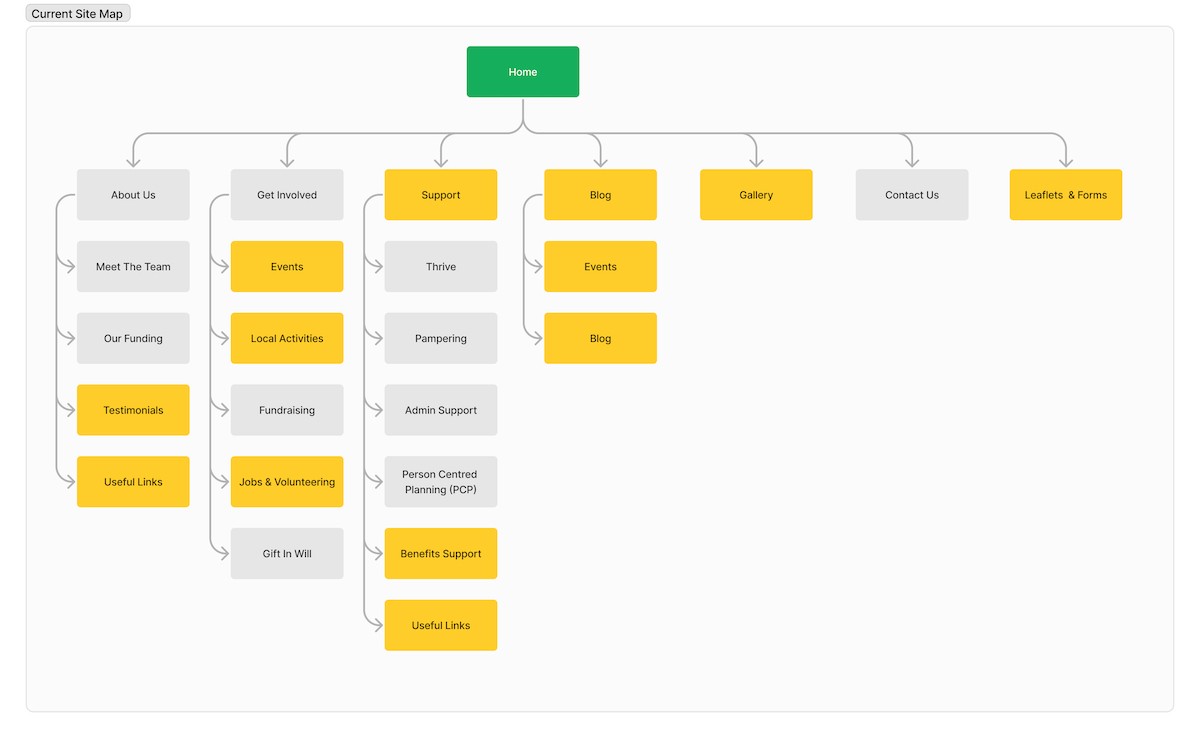
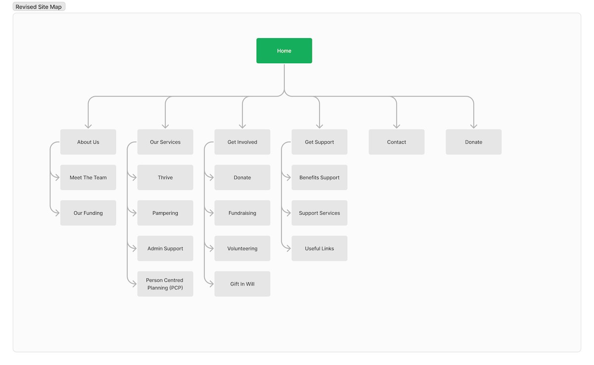
Site Map
I analysed each of the navigations pages to see how they could be streamlined. I soon discovered that some pages were out of date, unnecessary or could be merged into other pages.
By streamlining the sites navigation it makes it more simple to use and easier to find information.
Reduces the carbon footprint by decreasing steps needed to find and access information.
T.I.O has the aim to create an app that uses A.I to map clothes onto pictures of you that you upload. We had a look at the current market to see what companies offered similar try on experiences. As there were so many comparisons, I created a simplified analysis to show some of our teams findings.
Sketches & Low Fidelity Wireframing
I went through a series of concepts and Ideas before coming to the final wireframe designs. This was to make sure that the new layouts were user friendly and easy to navigate.


Green UX - Sustainability
Green UX
In my website redesign approach, I prioritized incorporating best practices to minimize the carbon footprint. Actions like opening and closing pages or navigating through multiple pages can impact the footprint and user experience. To assess Talbot House's site footprint, I conducted comparisons with testing websites, yielding valuable insights.
WebsiteCarbon.com
Producing 0.48g of CO2 each time someone visits
Overall rating of C!
This identifies that a redesign could help the overall carbon score
Ecograder.com
Ecograder.com in comparison had varying results
Overall rating of E!
Digital carbon rating is a much lower score
0.68g of CO2 is emitted per page load
Reducing Talbot House's Carbon Footprint
After identifying an approximate carbon footprint for the site there are a number of steps that can be taken to make it more "green."
Upload smaller images and files where possible
Opt for a simpler design over a complicated one
Optimise user journeys (getting from a to b quicker)
Prioritise accessible design

Branding & UI
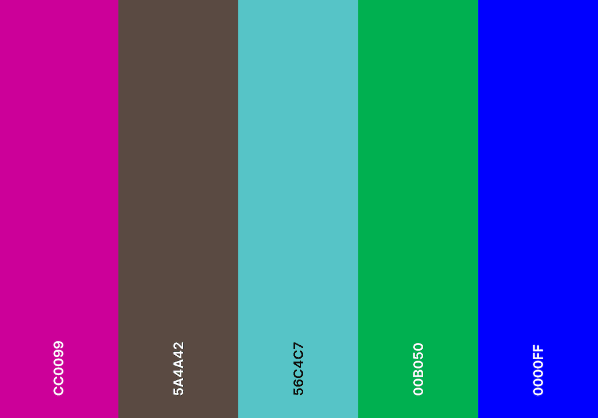
The Charities Current Colour Palette
Reviewed website colours: Core palette was simple, but text colours lacked coherence.
Noticed multiple hues for headings and links, leading to inconsistency.
Aimed to establish cohesive colour scheme for backgrounds and text.
Proposed simplifying text colours across the site for enhanced clarity and consistency.

The charities core colour palette
Used as background colours
Refined Colour Palette
The core colour palette pretty much stayed the same, though I changed the font colour that was used with them.
I added in a dark purple/maroon colour that fitted in with the subtitle of the charities logo.
I chose to keep the text colour palette simple with body text being black and button text colour being white.
Text weight and sizings were considered rather than different colours.

Redefined text colours
Used for buttons, headings & body text
Design System
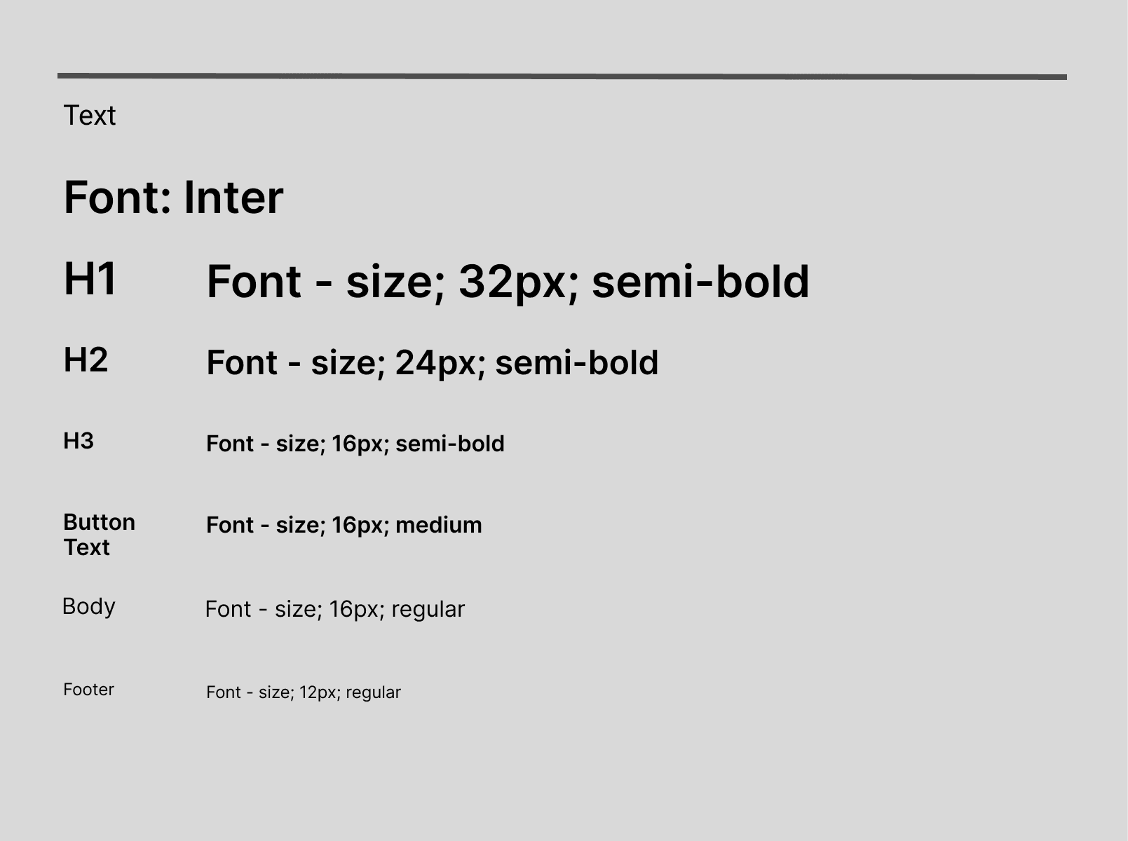
Typography
For typography I used Inter as my font and as an example went for 16px for body and button text.
Buttons & Icons
T.I.O has the aim to create an app that uses A.I to map clothes onto pictures of you that you upload. We had a look at the current market to see what companies offered similar try on experiences. As there were so many comparisons, I created a simplified analysis to show some of our teams findings.

Screen Size & Resolution
Ensuring compatibility across various devices and screen resolutions is essential in today's digital landscape. This inclusivity enables users to access products and services regardless of the device they choose, encouraging environmentally friendly options with lower carbon emissions.
Colour Contrast Initial Testing
I tested the charity's colour palette for compliance with color contrast AA standards. While certain combinations, like the dark brown body text against a white background, passed, others did not. Notably, the green footer section with white text failed to meet the standards, signaling a need to revise some colours on the site to ensure compliance with color contrast standards.
By meeting AA standards it means that the site will be more accessible to a wider audience
Better for SEO (search engine optimisation)
Reduces chances of accessibility lawsuits
Great for brand reputation
Increase the use of people using services and making donations
Speed up task completion
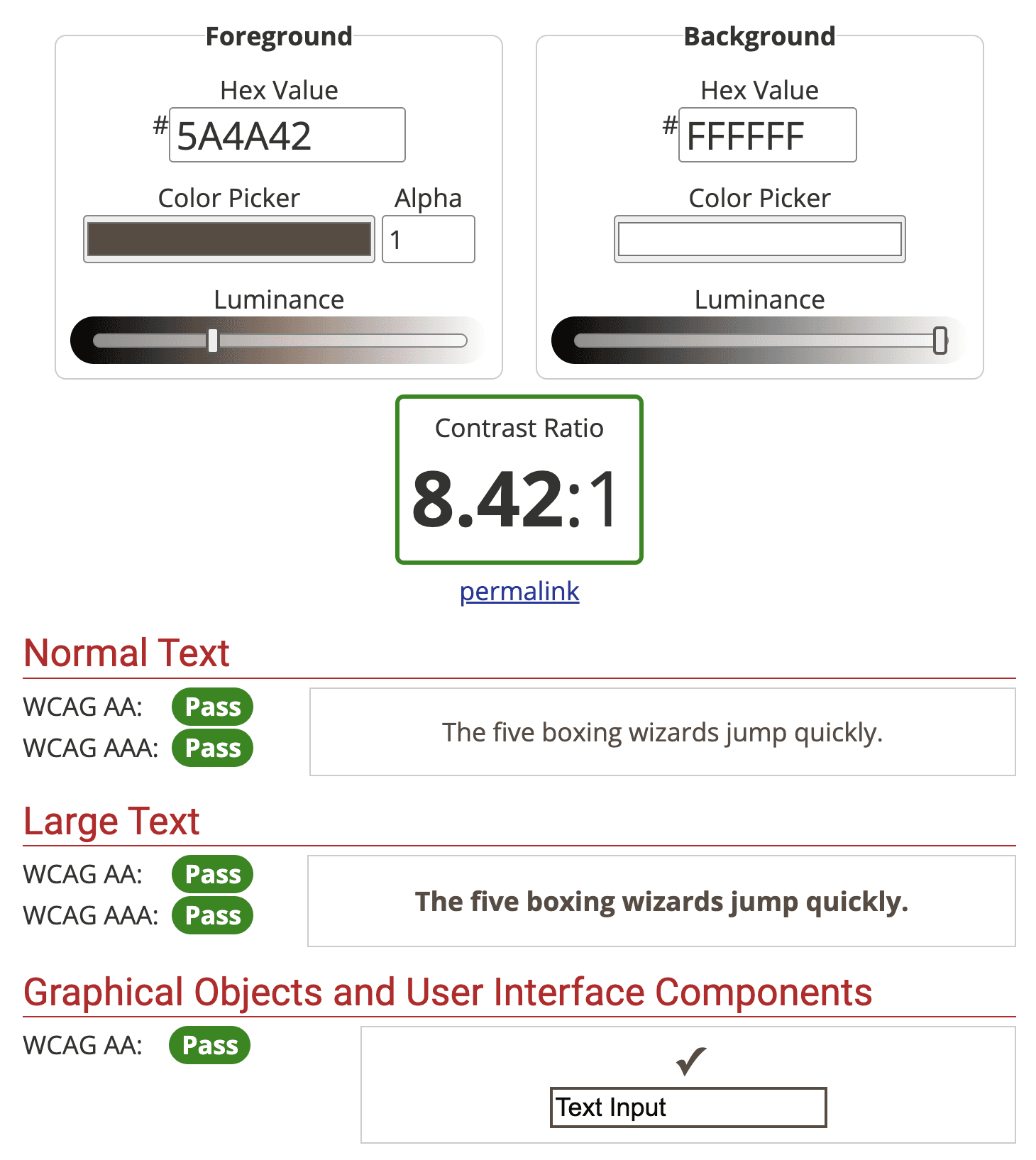
Background colour combined
with body text
Met normal & large text AA/AAA compliance

Footer background with
white text
Did not pass normal & large text AA/AAA

New Footer background with
white text
Decreased footer backgrounds luminance to make it AA/AAA compliant

Final Designs
After research, analysis and wireframing I was able to put together final designs that gave new life to the website. The changes I made are as follows:
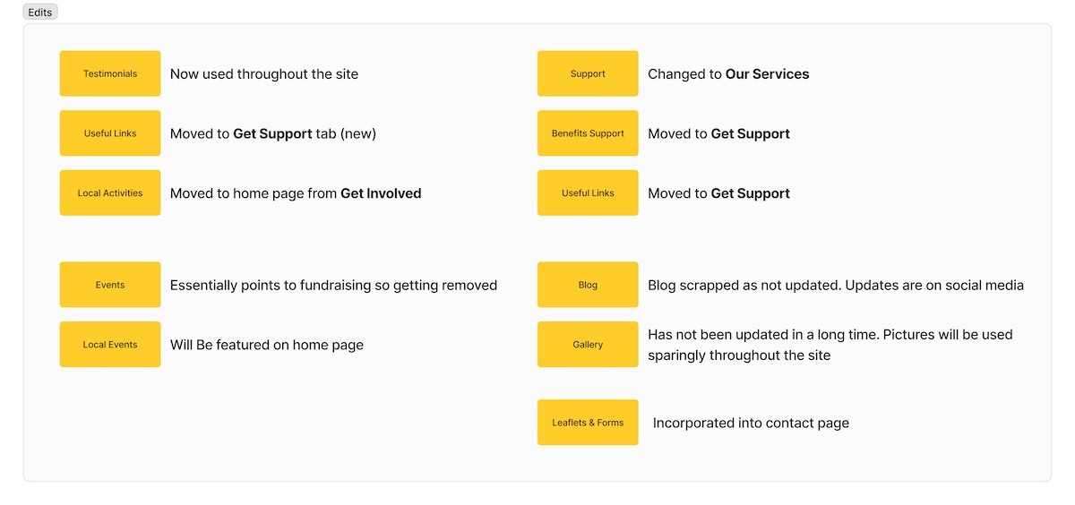
Navigation completely revamped and unnecessary pages/steps removed
Sections merged into other pages
Revamped colour scheme (colour palette simplified)
Accessibility improved
Reduction of pages and smaller images to help reduce carbon footprint
Mobile (Mobile Size 375 x 812)


© Robert Beeton 2024